I asked Sarah Jaworowicz, book designer, to guest blog about how she designed “Annetarsia Knits”. The PDF will go live on June 9th, one short week from today! This is the last week that the PDF will be available at the reduced pre-order pricing. Also, as good as the book looks in PDF, it looks even better as a Hardcover book. If you want an autographed copy at reduced pricing, you can only get that here.
Sarah: First off, I want to thank Anne for giving me this amazing opportunity. There are quite a few designers that she could have hired, but she took a chance on me, a fresh-out-of-school designer with little experience. So thank you, Anne! I have loved working on this book with you and getting my first real idea of what designing professionally is like!
When it comes to designing a book, I prefer to start from scratch. I know designers who work from the same templates for multiple projects in order to cut the time it takes to design or to keep costs down. That is fine, depending on the work the designer is doing, but it’s something that I try not to do. Every project is different, and requires an original design to emphasize the spirit of the book.
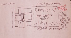
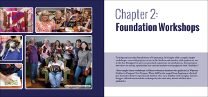
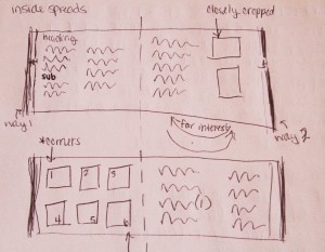
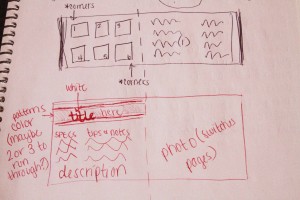
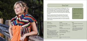
When I start a project, I look for some kind of inspiration. For your book, I was truly inspired by the photography. Bill, Raina, and Jessica did such a beautiful job, and the final images captured a unique quality, both of the knitting and the location. It took the design in a completely different direction than I was originally planning. I was also inspired by a Kaffe Fassett quilting book for the structure of the pattern pages, which I think is kind of funny, seeing as Anne mentions Kaffe as an inspiration for her intarsia work. Other times, inspiration can come from buzzwords, words like “sophisticated,” “edgy,” or “youthful.” I start sketching different potential layouts for the different parts of the book (chapter, pattern, etc.), and then build the best of those in Adobe InDesign. InDesign is my favorite program for this kind of job, and the one that I used for Anne’s book. If something isn’t working in a specific layout, (most of the time it’s because something looks a little awkward) I mess around with it, trying different solutions to the specific problem.
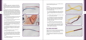
When I am finally happy with the layouts for each part of the book, I create templates to work from for that specific book. It would take forever to build each page of the book individually, especially if it is a book like Anne’s that has a lot of elements on each page and has a couple hundred pages. From there, I use those templates to build the rest of the book. Those templates are for that book, and I likely won’t use them again, unless I was doing another book for the same author. If Anne decides that she wants to write a second book, I would consider updating the templates for Annetarsia Knits to include some new details because using the same basic structure would help people recognize the book as hers. It creates a kind of brand. Of course, if the book was entirely different, I might not. It depends completely on the project.
Once the book is laid out entirely, it gets sent back to the author, editor, and any other members of the team, and the editing process begins. This is where it starts to get difficult, at least for me. This is usually because only very small things need to be changed, and can get less exciting from a design standpoint. At this stage, basically what I am doing is fixing typos and other errors in the text. Annetarsia Knits was different in this respect because we made a lot of changes that affected the actual design after the initial layout was complete. So it kept me on my toes!
Once the editing process is done, we send the book off to the printer, look over proofs again and again to make sure we didn’t miss anything, fix anything that needs fixing, and give the final sign-off to the printer. The book goes to press, and I get started on the PDF. For this book, the PDF was relatively simple to make. I used the exact files that we sent to the printer, and I added links, both internal, that will send you to another location within the book, and external, that will send you to a website. If we had wanted to do so, we could have added animation, like making it look like a page turning when a reader goes to the next page. However, knitting books are different from novels or other fiction books, where that kind of animation is more common. The animation isn’t really necessary, and can actually hinder movement around the document, which is essential for a knitting book. The process is very different if you actually want to create an e-book instead of a PDF. That can get a bit technical, so I will spare you the details.
From a graphic design standpoint, the PDF is very similar to the book, especially in terms of looks. The PDF is essentially the book. I build it from the same files, and then I add the links that allow you to jump from one part of the book to another, as well as the ones that go to a specific website. The thing that is different about the book and the PDF is how people view it. The book files need to look good in the printed format, which requires specific color settings. When the PDF is viewed on tablets or other electronic devices, the book’s colors can look very different than they would in print. So there is a lot of trial and error to make sure that the colors look the best they can in the new format.
As far as I know, you can read PDFs on any device (computer, tablets, e-readers, phones) provided you have the correct software to read them. For my computer (which is my favorite device to read PDFs), I use Adobe Acrobat Pro, which allows you to make notes on the PDF. This is actually how we edited Anne’s book, seeing as every person on the team lives in a different state. Some PDFs you can edit using this type of program, but the book designer (or anyone who makes a PDF) has the option of making it so it can’t be edited once it is exported from InDesign (or whatever program is used to create the PDF). This is the case with Annetarsia Knits, so you won’t be able to make any changes to the charts or other parts of the book. You should be able find out what software you need to read PDFs on the website for your device.

